Well.
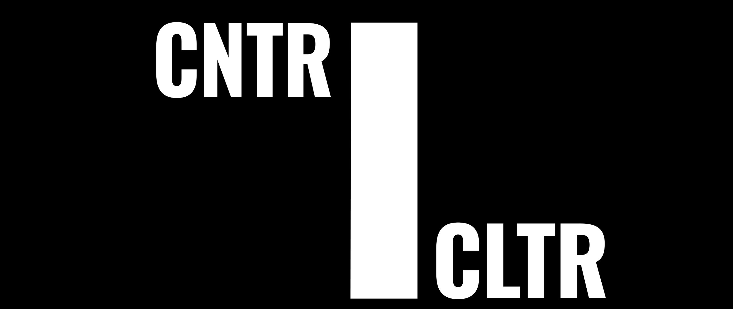
It has been a little bit longer than I had hoped to add another blog post, however I have not had much to note. Recently though I feel like I've finally broken ground on a logo for the site along with an animation for that logo.
For my site, I was very conflicted on what type of design I should go with originally (as noted in my previous post). After much deliberation, I decided that I should try to figure out how I wanted it to animate first before finalizing a design. This may seem backwards, but since I plan on integrating the animation heavily in the not-so-distant future, I decided that if I were able to determine how I want the animation to work, I'd be able to nail a logo I really liked.
As I was making the animation, I realized that I want the core of my site to be three things: short, slick, and simple. To that end I utilized the tools available to create something that I feel represents that most effectively.
After the countless number of designs that I drew down, I ultimately scrapped them all in favor of this. And the animation is primarily why.
I think that both the logo and it's animation represent the three principles I wanted to get across. As such I plan on using these from here on out once minor tweaks are done.
I'm very proud of getting to this point, and now I can move on to the next phase of my site: providing original content. I look forward to what I come up with going forward, and I can't wait to share it.
Let your life be creative,
Anthony


